
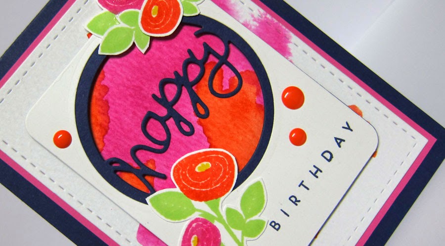


So, what do you think? Is it bright enough for you? :-) I finished it off by using a clear Wink of Stella glitter brush marker over the flowers and added some enamel dots.
Congratulations to our guest star stamper this week - Julie Beech of Crafted by Jules.
If you want more details on how to play along, visit the Color Throwdown blog (rules are in the sidebar). And...if you want some more inspiration, click on the design team blog links below:
Barbara Anders
Broni Holcombe
Joan Ervin
Jodi Collins
Lori Tecler
Monika Davis
Tammy Hershberger
Vickie Zimmer
Wanda Cullen (you are here)
Broni Holcombe
Joan Ervin
Jodi Collins
Lori Tecler
Monika Davis
Tammy Hershberger
Vickie Zimmer
Wanda Cullen (you are here)
Holly Brown - March Guest Designer
STAMPS: Bitty Bouquets (PTI), Wet Paint (PTI)
PAPER: Night of Navy, Raspberry Fizz, TH watercolor CS, White
INK: Night of Navy (SU), Ripe Persimmon and Picked Raspberry distress inks, Beanstalk (WPlus9)
ACCESSORIES: Happy die by PTI; Stitched rectangle die by Lil Inker Designs, Enamel dots by Recollections.

9 comments:
I love this bright colourful interpretation.
Thanks for having me as star stamper this week. :)
So pretty and cheerful. Love the background Wanda. The flowers are so pretty.
WOW, what a lovely selection of colours, hey!!!! And you have used it beautifully, Wanda!!! Love those sweet flowers!! Beautiful!!!!!
Hugz
Love the sponged background behind your happy!!! Those flowers are sweet!! Have to say I can't see the "off" part but, that may be why I have such a hard time off and on with getting my panels straight:)
It is bright--in a very good way! I love those flowers and that sponged background element!
Bold and bright and beautiful! LOVE all the bold touches from your watercoloring to the flowers to the fun enamel dots.
Love that background, Wanda...the Persimmon and Raspberry distress inks were perfect for this!
This is just fabulous, Wanda!! I LOVE bold and bright and beautiful!!
This is so fun! I love the die cut word against the bold watercolored background.
Post a Comment