Tuesday, September 30, 2014

Cardabilities & Color Challenge


I couldn't resist the great layout for the current Cardabilities Challenge  (oops...looks like linky is already closed). It paired up perfectly with Barbara's Color Challenge on SCS: Elegant Eggplant, Crushed Curry and Garden Green with the dessert option to use at least one leaf.  Thankfully I don't need a sympathy card right now, but my stash was in need of replenishing.  I really loved these colors together and rarely ever use eggplant or this shade of green.  I stamped off once for the two stamped leaves on the card base.  For the popped up leaves that were fussy cut, I used Garden Green without stamping off first.  I just can't seem to live with much white space, so had to add a trio of sequins to balance things out! :-)

STAMPS: Kinda Eclectic (SU), Loving Thoughts (SU)

Monday night football game is over (another big upset!), so now I'm off to bed.  Thanks for stopping by...

Monday, September 29, 2014

Coffee Lovers Bloghop


The blogosphere is on caffeine overload today with a Coffee Lovers Bloghop going on and I am hopping along by linking up to Chaitali's blog HERE where all the fun begins!  Grab your fave cup of joe and check out the creations.  By participating with an entry of your own, you just might win one of the many prizes that are up for grabs!  You can join in by posting a card on the link on Chaitali's post before 11:59 PST.
 

I created my card using papers from Teresa Collins' "Memorabilia" pad and stamps from Verve's Holiday Treats and Chevron Love.  These two sets coordinate so well with all the chevron design elements!  

I'm using the layout for the current Freshly Made Sketches challenge.

What else did I use?
Tagged Rectangle die, Wavy Heart die, Cup of Cheer die, Flourished Trim die - all by Verve; Wood veneer stars and arrow by Studio Calico; Brad by American Crafts; Black thread.

And...did you know there will be flash prizes throughout the day for this bloghop?  Every 3 hours, someone will be chosen for prizes!  Check out these sponsors...


My cup of choice is brewed in my Keurig and flavored with creamer - usually Amaretto, Hazelnut or one of the seasonal flavors.  I'm curious what your top choice of coffee might be.

Thanks a latte for stopping by...

Mojo Monday


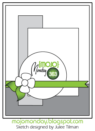
I went with some of my fave colors for the new tall and skinny Mojo Monday Challenge.  I let the print of the bird inside the frame outline dictate my sentiment - Verve's Hope Perches Plain Jane.  It was pure coincidence but thought it was funny that the bird's beak meets the end of the sentiment as though he "wrote" it!  Had I planned it that way, it wouldn't have worked - lol!  This fringed flower - stamped and sponged with Lost Lagoon - is one of my fave Verve flowers from the Sunny Days stamp set and love it paired with the leafy sprigs of greenery.  My card size is 3 1/2" x 5 1/2". 

If you'd like some more inspiration from the rest of the mojo makers, check out their blog links below:

Hope to see you in the gallery!

Wednesday, September 24, 2014

CASEing Bridget


I wanted to play along with the CAS(E) This Sketch challenge and I also wanted to pay tribute to Bridget Finlay who is "retiring" her hostess position for the Featured Stamper challenge on SCS. I'm such a fan of her vivid colors and non-stop, stunning creativity!  I chose Bridget's card HERE to CASE, but my watercoloring/stenciling background didn't turn out as crisp and defined as hers.  I've tried this technique before while taking the series of online watercolor classes and apparently am missing some key point - lol!  Oh well, it is what it is!

I used Tim Holtz' watercolor cardstock and adhered it to a clipboard with washi tape.  I then applied a wash of water over the entire BG.  Using some distress inks on acrylic blocks, I picked up colors with a wet brush and randomly applied the color.  I then placed a large dots stencil over the panel and placed a couple of heavy objects on top and waited several hours until it dried.  The feathers are white embossed on vellum.  The Retro Die-Namics border by MFT was cut using scrap pieces of CS from my stash, so I'm not 100% what colors I used.  The sentiment is a Plain Jane by Verve called Hope Perches.  Feathers are from Waltzingmouse Stamps' Fine Feathers set.

Thanks so much for stopping by!  Always love to hear your comments.

Color Throwdown


Check out the new Color Throwdown Challenge where Barbara is our hostess with these fab earthy colors (love those draperies)!


BABY ALERT!!!  We interrupt this Color Throwdown post to announce our new grand-daughter, Quinn, arrived last evening around 9 PM!  6 lbs. 8 oz. and 20 1/2" long!  Friday can't come soon enough to make the trip to see her and her proud mommy and daddy!  CAN.  NOT.  WAIT.


On to my CTD card...I started with the SU Kinda Eclectic set then thought I'd add a couple of punched tickets. That's where I did a U-turn in my planning process and decided to turn it into a boy baby card!  The tiny safety pin is MFT's Oh Baby Die-Namic and the baby rattle is a PTI die that coordinates with their Baby Button Bits set.

We are welcoming Karren Johnson of Stamping Stuff as our star stamper this week! Be sure and play along with us and you just might be in the spotlight next week by being our guest star stamper!  You don't have to have exact colors to play along, but you do need to have a close resemblance.  Be sure and link your creation to the linky tool at the bottom of the current challenge post on the Color Throwdown Challenge blog.
 

Want some more inspiration from the rest of the design team?  Check them out below...
Barbara Anders
Broni Holcombe 
Joan Ervin 
Jodi Collins 
Lori Tecler 
Monika Davis 
Vickie Zimmer 
Wanda Cullen 
Lisa Henke, September Guest Designer
Karren Johnson - Guest Star Stamper


STAMPS: Kinda Eclectic (SU), That's The Ticket (SU), Baby Button Bits (PTI).
PAPER: White (PTI), Pear Pizzazz, Kraft.
INK: Smoky Slate, Pear Pizzazz, Crumb Cake, Marina Mist.
ACCESSORIES: Button, Baby Button Bits die, Ticket punch (SU), Stitched circle die by Lil Inker Designs, Midnight Blend sequins by Avery Elle.


Tuesday, September 23, 2014

Mini Treat Bag


Today's Color Challenge on SCS is to use Blackberry Bliss, Hello Honey and Vanilla with the dessert option to add splatters.  I skipped dessert and went with this Moonlight Designer Series paper stack which is very close to the CC colors.  It has a white rather than vanilla BG but thought the Sahara Sand triangles were close to vanilla, so that the challenge police wouldn't come after me! :-)  We learned how to create these sweet little treat bags at our last SU stamp club meeting.  Easy to create and a fun way to slip a little chocolate treat inside and surprise a co-worker, friend, family member, etc.

Take a sheet of paper 4 1/2" x 6 1/2" and score at 1, 1 1/2, 2, 4, 4 1/2, 5 inches.  Then turn the paper and score at 1/2" along the bottom.  Cut away all of that 1/2" except the center section.  Angle the tab slightly to give it a more finished look after you fold the bag together.  The photo hopefully explains what I'm failing to convey well in words - lol!


I used scoring tape to secure the edges firmly together.  Then you can decorate your bag however you like!

STAMPS: #Hello (SU)
INK: Hello Honey, Blackberry Bliss
ACCESSORIES: 2" circle punch (SU), Word window punch (SU), In Color clothes pin (SU).

Monday, September 22, 2014

Mojo Monday


It's time to get your mojo going with a new Mojo Monday sketch challenge! Julee has a horizontal layout which I decided was perfect to create a manila folder with my envelope punch board.  My kids are all grown and no longer needing teacher gifts, but I fix card baskets to donate to different charities, so this will go into one of those. 

If you'd like some more inspiration from the rest of the mojo makers, check out their blog links below:


STAMPS: Teachers Count (Verve), Borderline (Verve).
PAPER: Hall Pass 6x6 pad by We R Memory Keepers, Vintage Cream (PTI).
INK: Chocolate Chip, Crushed Curry, Cherry Cobbler, Old Olive.
ACCESSORIES: Apples die set (Verve), Arrow die (Verve), Gold sequins by Avery Elle, Jute twine.

Friday, September 19, 2014

It's Time to Look Back at ODBD's September Release


Today, we are looking back at the fun sewing and quilting themed stamps and papers that were released this month at Our Daily Bread Designs. I used Copics to color the quilted focal image from the Quilts stamp set and paired it with a sentiment - also from the same set - then die cut using ODBD Vintage Labels die.  I accented it with ODBD Aster dies and an antiqued brass spool of thread charm.

Be sure and visit the Our Daily Bread Designs blog so you can see the entire release with all the sets and samples in one location!

The other breadsticks have more awesome projects that you don't want to miss!  Check out their blog links below...
 Chris * Grace * Julie * Cathy * Lori Sandee * Dawn * Paula * Stacy * Wanda


Thursday, September 18, 2014

Hello Friend


I came home from work after an unusually busy shift and decided to wind down with a little water color therapy! I got my inspiration from this gorgeous photo for the current Curtain Call Inspiration Challenge.  The stone wishing well led me to use a Mini Bricks stencil by TCW with a soft gray chalk color for a very subtle look of bricks.  I'm also playing along with the Just Us Girls Challenge where it's trend week and Vicki has chosen to
have us feature the water coloring trend that's so popular right now.  So, of course, I couldn't resist...yet again...to play with WPlus9's Pretty Peonies set!  This also qualifies for Cathy's Ways To Use It challenge on SCS to use stencils.  I used Tim Holtz distress markers to color on the acrylic stamps before I stamped to the watercolor cardstock.  I then softened the lines with a brush that was only lightly loaded with water. 

I'm barely keeping my eyes open, so I'm off to get some shut eye!  Thanks for stopping by!

Wednesday, September 17, 2014

Color Throwdown #310


Hey everyone! I'm your hostess for this week's Color Throwdown challenge and yes...I am hanging on to summer with dear life with some flowers and summer-like colors since fall isn't officially here yet - lol! I loved these embellishments found in an Etsy shop and went with a very literal interpretation for my card sample.


Here's what I used:
STAMPS: Whole Lotta Dots by Reverse Confetti
PAPER: Lost and Found "Sunshine" pad by MME, Crisp Cantaloupe, Pistachio Pudding, Coastal Cabana by SU, White by PTI.
INK: Coastal Cabana, Pistachio Pudding
ACCESSORIES: In Colors Boutique Details embellishments by SU; Quilted BG die by Lil Inker Designs; Tattered Florals dies by Tim Holtz, Wet Paint word die by PTI. 

Our guest star stamper is Joanne James from The Crafty Owl!  Welcome, Joanne!
Be sure and play along with us this week and you just might be in the spotlight next week by being our guest star stamper!  You don't have to have exact colors to play along, but you do need to have a close resemblance.  Be sure and link your creation to the linky tool at the bottom of the current challenge post on the Color Throwdown Challenge blog.
 

Want some more inspiration from the rest of the design team?  Check them out below...
Barbara Anders
Broni Holcombe 
Joan Ervin 
Jodi Collins 
Lori Tecler 
Monika Davis 
Vickie Zimmer 
Wanda Cullen 
Lisa Henke, September Guest Designer

Tuesday, September 16, 2014

Reverse Confetti Color Challenge


A creation for the new Reverse Confetti September Color Challenge. I scribbled Worn Lipstick, Mustard Seed and Pumice Stone distress markers over TH watercolor CS then blended with a wet brush.  I then die cut multiple paisley shapes.  The flamingo was stamped with Regal Rose and Crushed Curry ink and popped with foam dots.

STAMPS: Fabulous Flamingo, Arrows 'n Elements - both by Reverse Confetti.
PAPER: Soft Stone (PTI), Basic Gray (SU), Tim Holtz watercolor cardstock.

Monday, September 15, 2014

Mojo Monday


The weeks just keep flying on by and it's already time for another Mojo Monday challenge!  I had a ball creating this card for our soon-to-be born grand-daughter!  D-day is September 16, so we're anxiously awaiting the arrival of baby _____.  :-)  Can't share the name quite yet!


After die cutting the stitched rectangle panel, I added light texture paste with a hearts stencil by My
Favorite Things.  I thought it symbolized love "raining down"!  Emery was paper pieced with his head popped with a foam dot.
For more inspiration, you'll want to visit the other mojomakers' blogs below...OR...you can go to the Mojo Monday blog and check out the first 7 thumbnails.

STAMPS: To the Moon (Verve), Better Together (Verve).
PAPER: Nana's Nursery (DCWV), Sour Apple (MFT), White (PTI).
INK: Blushing Bride, Lucky Limeade, Versafine Onyx Black.
ACCESSORIES: Stitched rectangle and circle dies by Lil Inker Designs, Fishtail Flags Die-Namics by MFT, Enamel dots.

Thursday, September 11, 2014

Remembering


September 11 brings back a flood of memories every year when we remember that day 13 years ago
when the US was hit by overwhelming sadness as acts of terrorism changed so many lives forever. The SCS Ways to Use It challenge is to "make it monumental"....meaning we are to honor our heroes by incorporating elements of stone, granite, marble, etc.  on our creations.  I went with some Ferro Special Effect Paste by Creative Imaginations that has actual natural ground stone in the mixture and added it to Soft Stone cardstock using a TCW mini basketweave stencil.  It has a very hardened and rough texture IRL and I thought it would be perfect for this challenge!  I'm also playing along with Jen's Deconstructed Sketch Challenge.


STAMPS: ODBD Old Flag Background, ODBD Not Forgotten.
PAPER: Soft Stone by PTI, White, Real Red.
INK: Night of Navy, TH Distress markers - Barn Door and Faded Jeans.


Wednesday, September 10, 2014

More Watercolor Peonies


Another quick thank you card with some water coloring via Tim Holtz distress markers.  I used two step stamping with each peony image by brushing the marker ink on the stamp then blending with a small amount of water on a brush.   The first step was stamped off first to give a very faint amount of color.  Using distress markers adds a more minimal amount of ink than you get when using the ink pads.  Thanks for stopping by...it's time to head out to work shortly, so the stamp room therapy time is over for today! :-)

STAMPS: Pretty Peonies and Hand Lettered Thanks - stamp sets by W Plus 9.
PAPER: Raspberry Fizz (PTI), TH Watercolor paper.

Color Throwdown


Seriously..are you ready for some fab new colors for this week's Color Throwdown challenge? Did you notice we are no longer listing the color names?  We will show the swatch and it will be up to you to match whatever brand ink you prefer to keep it close to the photo colors!  Vickie is our hostess and has chosen a fun quilt for our inspiration!  I went with some hexagons to create this clean design and figured it was an element that had a hint of a quilting theme - as did the stitched rectangle and butterfly!


I cut two of the 'seriously' dies and glued them together for increased sturdiness.  When a number of the CTD team members got together for a fun weekend last spring, we shopped at Hobby Lobby one morning and I am FINALLY using a product I found in the clearance section!  What in the world was I waiting for?!  It's a jar of textured embossing paste that contains stone to simulate the look of sand, granite or marble.  It has a nice rough texture to it and I love the look!  I used it with a Hero Arts tweed pattern stencil.

STAMPS: TextStyle Happy Hexagons by PTI; Freebie sentiment by Verve.
PAPER: Pacific Point, Marina Mist, Basic Gray, White.
INK: Bliss Blue, Marina Mist, Lucky Limeade, Versafine Onyx Black.
ACCESSORIES: Stitched butterfly and rectangle dies, Seriously die by Lil Inker Designs; Fishtail Flags Die-Namics by MFT; Ferro Special Effect Paste by Creative Imaginations; Tweed pattern stencil by Hero Arts.

Be sure and play along with us this week and you just might be in the spotlight next week by being our guest star stamper!  You don't have to have exact colors to play along, but you do need to have a close resemblance.  Be sure and link your creation to the linky tool at the bottom of the current challenge post on the Color Throwdown Challenge blog.
 

Want some more inspiration from the rest of the design team?  Check them out below...
Barbara Anders
Broni Holcombe 
Joan Ervin 
Jodi Collins 
Lori Tecler 
Monika Davis 
Vickie Zimmer 
Wanda Cullen 
Lisa Henke, September Guest Designer

Monday, September 8, 2014

Mojo Monday


Hi, everyone! It's time for another Mojo Monday challenge and Julee's sketch was perfect to show off some new Verve goodies from the last release!  These sweet little bluebells were stamped with the outline image in black and the filler stamp in Soft Sky.  I wanted some depth to the image, so I layered a bit of color using an aquapainter brush and Soft Sky ink picked up from the lid after smooshing the ink pad together prior to opening it.  Using the same brush, I picked up color from a Pear Pizzazz pad for the stems and leaves.  The matching Bluebells die makes it so easy to pop up the image on your card.  The sentiment was gold embossed after stamping the frame image then cutting with Verve's Cupcake Frame die. 

I recently accompanied my daughter to Richmond where she had an appointment with a well known LASIK surgeon.  We did some shopping and one of our stops was Hobby Lobby where I picked up this paper pad by Glitz.  There's nothing like new paper to spark your mojo - lol!

So...what else did I use?
STAMPS: Small Packages (frame) and Framed Florals (flowers and sentiment) - both by Verve.
PAPER: Vintage Cream (PTI), Sunshine in my Soul (Glitz).
INK: Versamark, Versafine Onyx Black, Soft Sky, Pear Pizzazz.
ACCESSORIES: Gold/ecru twine by SU, Avery Elle gold sequins, Cupcake Frame die and Bluebells die by Verve.

For more inspiration, you'll want to visit the other mojomakers' blogs below...OR...you can go to the Mojo Monday blog and check out the first 7 thumbnails.