Pages

Friday, June 28, 2013

Think Big


Splitcoaststampers' Free 4 All Challenge is to "think big" and use a big embellishment or stamp. I
went with this big prima as a focal point and also paired up two new SU colors: Bermuda Bay and Smoky Slate!  LOVE this new light gray shade and am so glad they brought back Bermuda Bay!  Amber Hight's Deconstructed Sketch for this week was just perfect to highlight this flower. The BG is embossed using Cuttlebug's Bit of Paisley embossing folder and matching embossing border.

STAMPS: Flags and Tags Stamps by Lil Inker Designs
PAPER: Bermuda Bay, Smoky Slate, White
INK: Basic Gray
ACCESSORIES: Bermuda Bay grosgrain ribbon (SU), Prima by Prima Marketing, Foliage die by Spellbinders, Rhinestones by Kaiser, MFT Fishtail Flags Die-Namics, Bit of Paisley EF by CB, Foam mounting tape.

Thursday, June 27, 2013

RIP Google Reader


...I'm switching to Feedly to keep up with the many blogs I follow since Google Reader will be no longer in operation starting July 1. I found this helpful blog post on Mom of 6's blog and thought you might find it helpful as well! 

Mom of 6

Here is another blog post by Nathan that introduces you to Feedly:

Long Live Feedly

I've already added the "Today" button to the top of my computer so I can click on it quickly and see what all my crafty friends are up to!  The format is in a magazine style with this setting.

On a different note, I'm heading out the door for a mani/pedi date with my daughter!
Have a blessed day! 
 

Wednesday, June 26, 2013

Color Throwdown


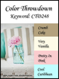
Hi everyone! It's Wednesday and that means it's Color Throwdown Challenge time! Broni has a really sweet color combo...inspired by this vintage Mason jar and flower photo.  I brayered Cool Caribbean ink onto a Kassie's Brocade EF then inserted some Vintage Cream CS and ran it through the Big Shot.  I popped that panel up using foam tape, then came the fun layering part!  I paper pieced the "brighter" word of the sentiment using Pretty in Pink CS.  Since I no longer had any Cool Caribbean CS, I subbed some turquoise CS that was in my leftovers stash.  I never would have thought to combine these colors, but loved the end result!  I'm also playing along with the Deconstructed Sketch Challenge.

So, jump right in and join us!  Remember, if you don't have the exact colors, use something that's close...we want you to have fun!  If you upload to a public gallery, be sure and use the key words CTD248.  Also, link up your card on the Color Throwdown blog using the linky tool at the bottom of the post.  For more inspiration, check out the other design team members' creations...including our talented June guest designer, Wanda Guess!  This will be her last challenge with us, so be sure to stop by her blog and say hello!  Thanks so much for sharing with us, Wanda!


Barbara Anders - Paper Pursuits
Broni Holcombe - Splashes of Watercolor
Joan Ervin - Stamping With Passion
Tammy Hershberger - Stamp Happy
                                    Wanda Cullen - Cullen-ary Creations (you are here) 
Denise Marzec - The Paper Landscaper
  June Guest Designer - Wanda Guess - A Blog Called Wanda

STAMPS: Let It Be (Verve)
PAPER: Vintage Cream, Pretty in Pink, Tempting Turquoise
INK: Cool Caribbean, Versamark Onyx Black
ACCESSORIES: Circle Nesties, Leafy Flourish Die-Namics by MFT, Burlap shapes by Little Yellow Bicycle, Hand-crocheted flower by my mom, Button embellishment by Recollections, Dimensional rhinestone sticker by Jolee's Boutique.

Monday, June 24, 2013

Mojo Monday


Hard to believe, but once again...it's the last Monday of the month!  That means it's a round or square Mojo Monday challenge and some lucky participant has a chance to win some free Verve!  I went with a 4 1/2" square option using these gorgeous papers from DCWV's Violet Leaf mat stack.  I decided to keep the circle element open so I wouldn't cover up as much of the DP.  The flower was fussy cut, sponged, edges ruffled up and popped with foam dots.

You'll want to check out the other mojo makers' blogs below for more inspiration!
Wanda Cullen (you are here)
STAMPS: Hope Blooms (flower), Borderline (sentiment, chevron border and frame outline) - both by Verve.
PAPER: Vintage Cream, Violet Leaf mat stack by DCWV.
INK: Bermuda Bay, Wisteria Wonder, Old Olive, Versafine Onyx Black.
ACCESSORIES: Wonky Rectangles Nesties, Button (SU brights collection), Rhinestones, Fishtail Flags Die-Namics by MFT, Mini Vintage Oval dies by Verve, Plum seam binding by Martha Stewart, Circle Nesties, Foliage die by Spellbinders.

Friday, June 21, 2013

Mix-Ability Challenge


My fingers are testament to my first attempt with Splitcoaststampers' Mix-Ability Challenge! I love the mixed media look but have shied away from it...until now.  Ky's video tutorial was really helpful and even though I didn't have any gesso, I did layer up the colors.  I first dabbed 3 "puddles" of distress paint on a paper plate: Salty Ocean, Mustard Seed and Peeled Paint.  I then sprayed what I thought was water in a spray bottle.  I must have added some shimmer to it with a previous project and when I dried the CS after "pulling" it through the paints, it had a real glittery look when I angled it to the light!  At that point, I decided to pull out my TCW "Starry Starry Night" 5x8 stencil.  I put some Picket Fence distress paint on a plate, spritzed it with water, then stippled it over the CS using the stencil.  After drying the BG, I added a pennant die cut banner and sequins.  I'm also playing along with the Free 4 All Challenge to create a CAS card with a summer image/theme.   Blue skies, yellow sunshine and green grass were the color inspirations.  Ahhh...there's nothing like sitting out on a clear, summer night watching the stars! 

STAMPS: Shining Star (Verve)
PAPER: Pacific Point, White.
INK: Versamark Onyx Black
ACCESSORIES: Pennant Trim die by Verve, Sequins, Distress paints by Tim Holtz.

Wednesday, June 19, 2013

Color Throwdown


It's Wednesday and it's time for another Color Throwdown Challenge! We've got this wonderful patriotic color combo and inspiration photo on board...thanks to the talented Barbara Anders!  I took a different route with the theme (yep, pun intended) since I needed a masculine card. :-)


The card is 3 1/2" by 6 1/2" and includes a pocket on the inside to tuck in a gift card or money.  I used a couple of metal gear embellishments by Tim Holtz to add more masculine "flavor".  The vintage truck was stamped with navy ink over a denim print paper then fussy cut and popped over the postcard.  The little banners were cut from one of the designer papers.

 So, climb aboard and play along with us!  Remember, if you don't have the exact colors, use something that's close...we want you to have fun!  If you upload to a public gallery, be sure and use the key words CTD247.  Also, link up your card on the Color Throwdown blog using the linky tool at the bottom of the post.  For more inspiration, check out the other design team members' creations...including our talented June guest designer, Wanda Guess! 

Barbara Anders - Paper Pursuits
Broni Holcombe - Splashes of Watercolor
Joan Ervin - Stamping With Passion
Tammy Hershberger - Stamp Happy
                                    Wanda Cullen - Cullen-ary Creations (you are here) 
Denise Marzec - The Paper Landscaper
  June Guest Designer - Wanda Guess - A Blog Called Wanda

STAMPS: Tim Holtz Visual Artistry Collection "The Journey"
PAPER: Bazzill "Moody Blue", PTI "Kraft", Simple Stories "Summer Fresh"
INK: SU Night of Navy and Real Red
ACCESSORIES: MFT Die-Namics Fishtail Flags, Tim Holtz idea-ology Sprocket Gears, Scotch foam mounting tape, May Arts jute twine, MFT Die-Namics Horizontal Gift Card Pocket.


Tuesday, June 18, 2013

CAS & Color Challenges


A quick card for two challenges on Splitcoaststampers: CAS (sketch) and Color Challenge (Midnight Muse, Gumball Green, Rich Razzleberry). My card base is a textured white though it doesn't show up well in the photo.  I stamped off the ink colors first to give them a less stark, water colored look.

STAMPS: Watercolor Wonder and Side by Side Sentiments by Papertrey Ink
INK: Midnight Muse, Gumball Green, Rich Razzleberry, Versafine Onyx Black
ACCESSORIES: Heidi Swapp heart ghost shape, Candy Dot (SU), Tiny flower punch by SU, Corner Chomper.

Looks like I'll be using the umbrella yet again today!  Had major downpours off and on all last evening!  Got drenched leaving work to get to my car!  Have a great day...wherever you are and whatever the weather!

Monday, June 17, 2013

Mojo Monday


Good Monday morning everyone!  We had a wonderful time with family yesterday to celebrate Father's Day and my DH's birthday...steaks on the grill for lunch and lots of laughs while our middle son and fiance' picked out photos to scan for a video they plan to show at their wedding reception! 

It's time for another Mojo Monday challenge and Julee has another fabulous layout for us!  I tend to create A2 cards in the vertical position, but decided to stick with the horizontal layout this time and loved it!  Lots of bright colors and patterns going on here and wasn't sure if I had overdone it - lol!  I wanted to play with Taylored Expressions' new Ray of Sunshine cutting plate...so fun!  I cut it down and layered it on a white panel of CS; added the sun after fussy cutting and embellishing with a SU button from their brights collection.  I chomped the corners to soften up all the sharp angles that were on the card.

STAMPS: Learning to Sail (sun); Let it Shine (sentiment) - both sets by Verve.
PAPER: Park Bench by Fancy Pants Designs.
ACCESSORIES: Corner chomper, Ray of Sunshine cutting plate by Taylored Expressions, Button, Baker's twine, Pennant Trim and Charming Oval dies by Verve.

You'll want to check out the other mojo makers' blogs below for more inspiration!
Wanda Cullen (you are here)

Can't wait to see what you create...hope you can join us!

Thursday, June 13, 2013

Deconstructed Sketch


Good Thursday morning! Before I head to the dentist for my routine cleaning and gnashing of teeth, I made this quick birthday card for my oldest son who turns 30 next week. What??? I can't believe it, but it's true, so now I'm feeling pretty old myself - lol!  This is for the Deconstructed Sketch Challenge where Sheri Gilson is filling in for Jen with this super sketch!

STAMPS: Strong Anchor (Verve), Big Wish (Verve)
PAPER: Oxford Lane by MME, Daffodil Delight, Night of Navy, White
INK: Night of Navy
ACCESSORIES: Nautical die set (Verve), Circle Nesties, Postage stamp border Die-Namics (MFT), Fishtail flags Die-Namics (MFT), Satin ribbon, Baker's twine, QuicKutz nautical embossing folder.

The wind is picking up and it's raining...VA is bracing for strong thunderstorms today!  Guess the current blooming flowers will be gone with the wind before day's end.  Be safe everyone!

Wednesday, June 12, 2013

Vintage Vagabond


I'm playing along with the Tuesday Trigger challenge on the Moxie Fab World blog and also used the layout for SCS' Sketch Challenge. I pulled geometric elements from the trigger photo (diamonds in DP and retro square border) and added the metallic touches by swiping my Versamark pad along the edges of the butterfly and embossing with gold EP.  The sentiment also echoes a vintage feel - with sponging using Antique Linen distress ink. 


STAMPS: Rescue Remedies (Waltzingmouse Stamps)
PAPER: Graphic 45 French Country collection
INK: Versafine Onyx Black, Versamark
ACCESSORIES: Ranger Queen's Gold EP, Butterfly die by Cheery Lynn Designs, Retro square Die-namics border by MFT, Corner chomper, Labels Four Nestabilities, Black rhinestones.

Color Throwdown


Hi, everyone! It's my turn to host this week's Color Throwdown challenge !  Since June is known as a month for brides, I chose a bridal bouquet for the inspiration picture.  Our middle son will be getting married on June 30, so I've had wedding details on my mind for some time!


I love this new PTI floral set and decided to get it inky for my card!  I pulled some retired SU papers out of the archives and used Chupa's layout for her Sketchbook Saturday Challenge.

I'm hoping you'll love these colors and say "I do" (grin).  Remember, if you don't have the exact colors, use something that's close...we want you to have fun!  If you upload to a public gallery, be sure and use the key words CTD246.  Also, link up your card on the Color Throwdown blog using the linky tool at the bottom of the post.  For more inspiration, check out the other design team members' creations...including our talented June guest designer, Wanda Guess! 
Barbara Anders - Paper Pursuits
Broni Holcombe - Splashes of Watercolor
Joan Ervin - Stamping With Passion
Tammy Hershberger - Stamp Happy
                                    Wanda Cullen - Cullen-ary Creations (you are here) 
Denise Marzec - The Paper Landscaper
  June Guest Designer - Wanda Guess - A Blog Called Wanda


STAMPS: Ruby Rose (PTI), Rainbow and Cloud Sentiments (Lil Inker Designs)
PAPER: Cottage Wall (SU), Rich Razzleberry, White
INK: Rich Razzleberry, Blushing Bride, Old Olive, Versafine Onyx Black
ACCESSORIES: Brights Collection button by SU, Sentiment flag die by Lil Inker Designs, Grosgrain ribbon (SU), Ruby Rose coordinating dies by PTI, Adhesive pearls.

Monday, June 10, 2013

Popped Sentiment


I combined the SCS Technique Lover's Challenge (to pop up a portion of your sentiment) with the CAS Challenge to use these colors: hot pink, kraft, celery green, white.  It's not exactly a one layer card - lol - but hope all the white space will qualify it as CAS. 

STAMPS: Ruby Rose (PTI), Hearts a Flutter (SU)
PAPER: True Friends 6x6 pad by Carta Bella, Neenah Solar White
INK: Pretty in Pink, Certainly Celery, Crumb Cake, Versafine Onyx Black
ACCESSORIES: Ruby Rose dies (PTI), Jute twine, Button, Hearts a Flutter framelits die (SU).

Mojo Monday


June is a month of many male birthdays in my family, so it was a no-brainer about what kind of card I needed to create for the Mojo Monday Challenge!  My dad will turn 87 on the 15th, so this card will be making its way to the post office today!  His favorite color is blue so I went with these papers  from Authentique's "Original" 6x6 pad.  I flattened a bottle cap in my Big Shot and added a 1" punched circle of DP, a metal butterfly embellishment by Recollections and a navy pearl.  The large flag is a Fishtail Flag Die-Namics from MFT.  The pennant trim border die and the occasion frame die - both by Verve - were also used.

STAMPS: On Occasion (Verve), Dad's Day (Verve)
INK: Night of Navy, Chocolate Chip

You'll want to check out the other mojo makers' blogs below for more inspiration!
Wanda Cullen (you are here)

So, get your mojo moving and join us...can't wait to see what you create!

Friday, June 7, 2013

CAS Sympathy


Fortunately I'm not needing a sympathy card, but I like to keep them on hand for that last minute need. I created this card with four different challenges in mind:
Free for All - field of flowers theme (use at least 4 flowers)
Colour Q - Soft Sky, Island Indigo, Going Gray, Certainly Celery
CAS-ual Fridays - banners and flags

I've had this PTI Larger than Life stamp set with coordinating dies for a couple of months and never got it inky until now!  About time I remedy that problem - lol!  Totally LOVE these colors and also loved this layout!

The upper portion of the background was dry embossed using the herringbone folder by Cuttlebug.  I kept wanting to add random pearls or a bow and decided that less was more for a sympathy card.  

STAMPS: Larger than Life (PTI), Borderline (Verve) - sentiment.
PAPER: Island Indigo (SU), Neenah Solar White, White (PTI).
INK: Basic Gray, Going Gray, Certainly Celery, Soft Sky, Island Indigo.
ACCESSORIES: Herringbone EF, Framed Tags One by Spellbinders, Pennant trim die by Verve, Soft Sky ribbon by SU, Larger than Life dies by PTI.

Some people are lamenting the fact that it's been raining all day.  Me?  It gives me an excuse for more time in my stamp room! :-)  Thanks for stopping by...I always appreciate reading your comments!

Thursday, June 6, 2013

Happy Father's Day


Tropical storm Andrea has robbed us of sunshine today, but I'm thinking this rain will really make things grow (insert an anxious to eat fresh tomatoes face here)! I needed to make a father's day card, so 3 different challenges came together for this card:
Simon Says Stamp Challenge (masculine/father's day theme)
Ways to Use It Challenge (feature music and/or musical instrument)

I flipped Jen's sketch to a vertical version and popped the musical BG panel with foam tape.  Then it was layering time...three die cut flags, a heart circle Nestie and a fussy cut vintage truck image stamped with Riding Hood Red ink.  A metal arrow w/brad and some bling finished it off.  Patterned papers are all from MME's Lost and Found "Union Square" pad.

STAMPS: Tim Holtz "The Journey"; Verve "Dad's Day".

Wednesday, June 5, 2013

Sketchbook Saturday Challenge


I came home from an afternoon of CPR renewal at work and wanted to get inky to wind down!  I created this card for Iwona's Sketchbook Saturday Challenge...tweaking it a bit to suit my taste. :-)  I told myself I needed to make a masculine birthday card, but this leafy flourish was already cut and I thought it fit well for the one vertical element...so, no masculine card afterall - lol!  The scalloped circle is a chipboard frame by Bazzill Basics Paper. I used several different Die-Namics dies by My Favorite Things - fishtail flags, large rose, medium leafy flourish.  I die cut a white circle then dry embossed using a diamond embossing folder.

STAMPS: Take Note (Verve)
PAPER: On the Bright Side-Two (MME), Orange Zest and White (PTI).

Color Throwdown Meets SFYTT


It's time for another Color Throwdown challenge (Tammy is our hostess with the mostest) and I'm happy to see that Jen is bringing back her Sketch For You To Try challenge over on the Reverse Confetti blog! So...I decided to combine the two! I'll admit I struggled pairing up the coral and hot pink colors, so you'll have to look closely - the only pink is in the one rhinestone. :-)  I sponged a subtle background using Daffodil Delight ink and a honeycomb stencil.  I managed to scrounge up one last sheet of Barely Banana CS in my retired SU stash.

What else did I use?
STAMPS: Peacock Pretties by Reverse Confetti.
PAPER: Barely Banana, Kiwi Kiss, White.
INK: Groovy Guava, Kiwi Kiss, Daffodil Delight, Black
ACCESSORIES: Corner chomper, Rhinestones, Baker's twine by pinkpaislee, Framed Tags One by Spellbinders.
We'd love to see what you create using this fun color palette!  If you don't have the exact colors, just use something close.   If you upload to a public gallery, be sure and use the key words CTD245.  Also, link up your card on the Color Throwdown blog using the linky tool at the bottom of the post.  For more inspiration, check out the other designers' creations...including our new and talented June guest designer, Wanda Guess...WELCOME! 
Barbara Anders - Paper Pursuits
Broni Holcombe - Splashes of Watercolor
Joan Ervin - Stamping With Passion
Lori Tecler - Inking Aloud
Lynn Put - The Queen's Scene
                                    Wanda Cullen - Cullen-ary Creations (you are here) 
Denise Marzec - The Paper Landscaper
  June Guest Designer - Wanda Guess - A Blog Called Wanda